Icon
Icon
There are many ways to use icons in the project as follows.
Component library icons
Use icons provided by ant-design-vue
<template>
  <StarOutlined />
  <StarFilled />
  <StarTwoTone twoToneColor="#eb2f96" />
</template>

<script>
import { defineComponent } from "vue";
import { StarOutlined, StarFilled, StarTwoTone } from "@ant-design/icons-vue";
export default defineComponent({
  components: { StarOutlined, StarFilled, StarTwoTone },
});
</script>
Svg Sprite Icon
Use
Put the required svg icons into src/assets/icons
Example: test.svg
- Use the
SvgIconcomponent for display
<template>
  <SvgIcon name="test" />
</template>

<script>
import { defineComponent } from "vue";
import { SvgIcon } from "/@/components/Icon";
export default defineComponent({
  components: { SvgIcon },
});
</script>- Use the
Iconcomponent for display
Ending with |svg will automatically use the SvgIcon component
<template>
  <Icon name="test|svg" />
</template>

<script>
import { defineComponent } from "vue";
import { Icon } from "/@/components/Icon";
export default defineComponent({
  components: { Icon },
});
</script>
Iconify icon
For usage, please refer to Icon Component
The plugin used in the project is vite-plugin-purge-icons for icon implementation.
- Install dependencies
pnpm add @iconify/iconify

pnpm add @iconify/json @purge-icons/generated -D- Use the plugin in
vite.config.ts
import PurgeIcons from "vite-plugin-purge-icons";

export default {
  plugins: [PurgeIcons()],
};- Write the Icon component
Complete code src/components/Icon/src/Icon.vue
<template>
  <SvgIcon
    :size="size"
    :name="getSvgIcon"
    v-if="isSvgIcon"
    :class="[$attrs.class]"
    :spin="spin"
  />
  <span
    v-else
    ref="elRef"
    :class="[$attrs.class, 'app-iconify anticon', spin && 'app-iconify-spin']"
    :style="getWrapStyle"
  ></span>
</template>
<script lang="ts">
import type { PropType } from "vue";
import {
  defineComponent,
  ref,
  watch,
  onMounted,
  nextTick,
  unref,
  computed,
  CSSProperties,
} from "vue";

import SvgIcon from "./SvgIcon.vue";
import Iconify from "@purge-icons/generated";
import { isString } from "/@/utils/is";
import { propTypes } from "/@/utils/propTypes";

const SVG_END_WITH_FLAG = "|svg";
export default defineComponent({
  name: "GIcon",
  components: { SvgIcon },
  props: {
    // icon name
    icon: propTypes.string,
    // icon color
    color: propTypes.string,
    // icon size
    size: {
      type: [String, Number] as PropType<string | number>,
      default: 16,
    },
    spin: propTypes.bool.def(false),
    prefix: propTypes.string.def(""),
  },
  setup(props) {
    const elRef = ref<ElRef>(null);

    const isSvgIcon = computed(() => props.icon?.endsWith(SVG_END_WITH_FLAG));
    const getSvgIcon = computed(() =>
      props.icon.replace(SVG_END_WITH_FLAG, "")
    );
    const getIconRef = computed(
      () => `${props.prefix ? props.prefix + ":" : ""}${props.icon}`
    );

    const update = async () => {
      if (unref(isSvgIcon)) return;

      const el = unref(elRef);
      if (!el) return;

      await nextTick();
      const icon = unref(getIconRef);
      if (!icon) return;

      const svg = Iconify.renderSVG(icon, {});
      if (svg) {
        el.textContent = "";
        el.appendChild(svg);
      } else {
        const span = document.createElement("span");
        span.className = "iconify";
        span.dataset.icon = icon;
        el.textContent = "";
        el.appendChild(span);
      }
    };

    const getWrapStyle = computed((): CSSProperties => {
      const { size, color } = props;
      let fs = size;
      if (isString(size)) {
        fs = parseInt(size, 10);
      }

      return {
        fontSize: `${fs}px`,
        color: color,
        display: "inline-flex",
      };
    });

    watch(() => props.icon, update, { flush: "post" });

    onMounted(update);

    return { elRef, getWrapStyle, isSvgIcon, getSvgIcon };
  },
});
</script>
<style lang="less">
.app-iconify {
  display: inline-block;
  // vertical-align: middle;

  &-spin {
    svg {
      animation: loadingCircle 1s infinite linear;
    }
  }
}

span.iconify {
  display: block;
  min-width: 1em;
  min-height: 1em;
  background-color: @iconify-bg-color;
  border-radius: 100%;
}
</style>
Icon selector
Icon set pre-generation
Due to the special existence of the icon selector, the project will package some more icons. The icons of the icon selector need to be specified in advance and generate corresponding files.
Generate
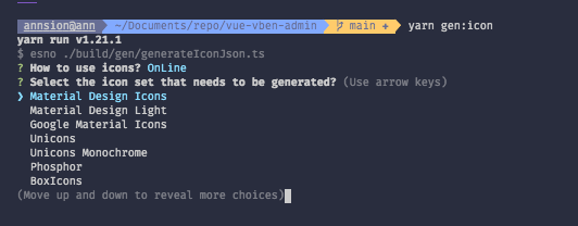
- Execute the icon generation command
pnpm gen:icon- Here you will be asked to choose whether to generate locally or online. Both methods have their advantages and disadvantages. As shown below
local means local, online means online, press Enter to confirm

- Choose the icon set you want to generate and press Enter to confirm

- Choose the directory where the icons are output (the project defaults to src/components/Icon/data), you can directly press Enter to select the default

At this point, the icon set has been generated. At this time, your icon selector is already the icon of the icon set you selected.
Do not update frequently
If you choose to generate locally before, frequent replacement of icon sets may cause icons to be lost or not displayed.
Advantages and disadvantages
- Online icons (project default, recommended)
This method will request online when the icon selector uses icons, and then cache the corresponding icons to the browser. Can effectively reduce code packaging volume.
If your project can access the Internet, it is recommended to use this method.
Disadvantages: Icons cannot be displayed in an intranet or environment where external networks cannot be accessed.
- Local icons
This method will package all the icons of the icon selector into js when packaging. There will be no additional requests for online icons when using them.
Disadvantages: The packaging volume will be larger. The specific volume increase depends on how many icons are selected when selecting the icon set before.